Home
Latest Amorepacific
News
-
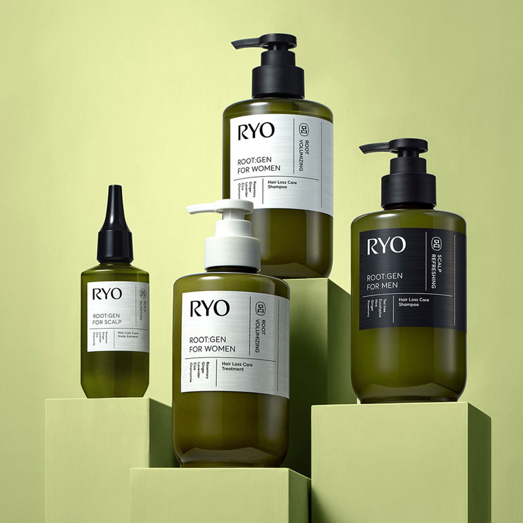
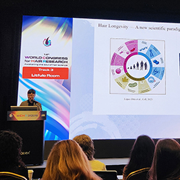 Amorepacific Presents a Paradigm Shift in 'Healthy Hair Formation' at the World Congress for Hair Research
 -
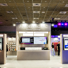 Amorepacific Successfully Concludes 'Beauty Concierge' Exhibition at AWS Summit Seoul 2026
 -
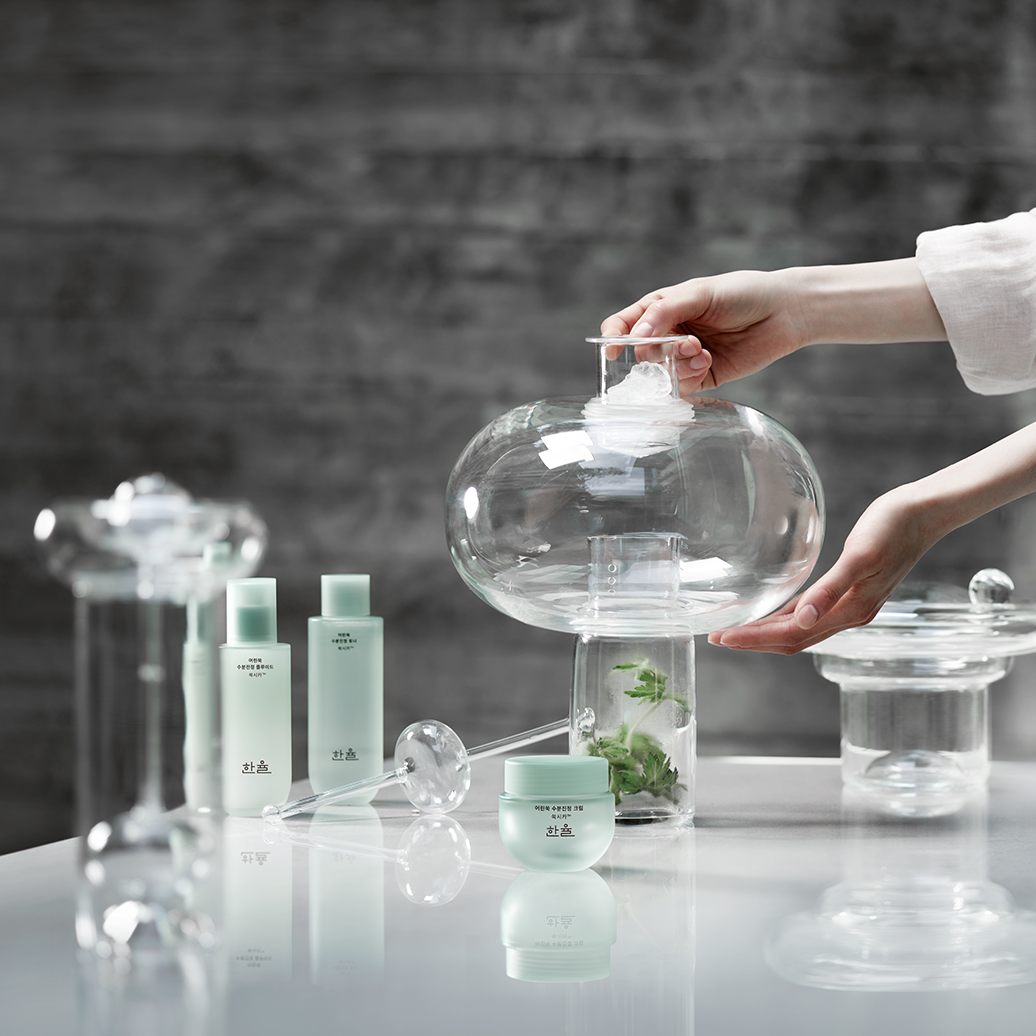
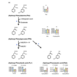 Amorepacific Discovers Core Substance for Youthful Skin Driven by Microbiome Science
 -
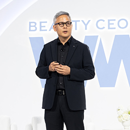 Amorepacific Outlines Sustainable Growth Strategy for K-Beauty at the '2026 WWD Beauty CEO Summit'
Story of Amorepacific
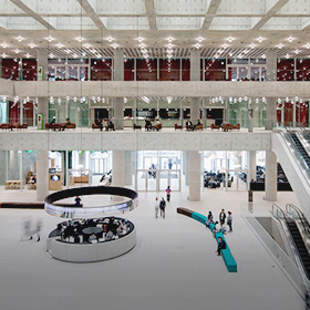
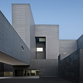
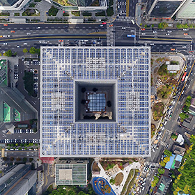
Amorepacific reflects its vision and promise to society in its spaces. Amorepacific architecture holds the spirit of the company’s dedication in delivering beauty to the world. And we hope that not only Amorepacific members, but also citizens can share and feel that value. Our buildings are created by Amorepacific, but the spaces are for everyone, and everyone who use the space will share that value.
Story of Amorepacific


With deep empathy towards the world, Amorepacific promises new 2030 sustainability management goals to create a better tomorrow. Amorepacific will promote a sustainable life for customers through brand activities and create a society that grows inclusively with various stakeholders. We will also actively participate in responding to the climate crisis and improving resource circulation.
Story of Amorepacific


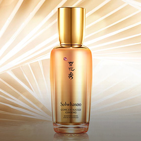
Amorepacific believes the quality to satisfy our customers from the customers’ point of view is important beyond the functional quality of our products. We make every effort to provide customers with the best product environmentally and socially valuable product to customers.
Story of Amorepacific


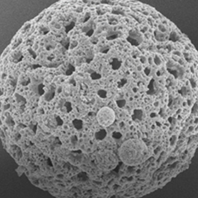
Amorepacific delivers the strongest trust based on the most advanced science and technology. Our creation and passion, which originated from Amorepacific founder’s philosophy that ‘we must secure competitive edge in science and technology to become a global leader’, has continued for more than 80 years. Amorepacific will continue to pursue technology innovation to deliver the best and the first products to customers worldwide.
Story of Amorepacific
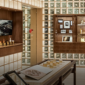
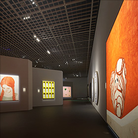
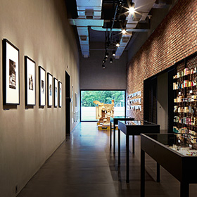
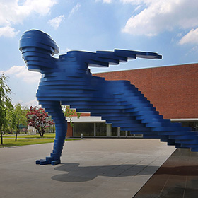
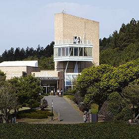
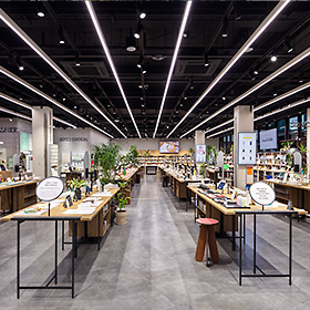
Amorepacific strives to deliver spaces that hold beauty to customers – from its headquarters that shares and experiences beauty with citizens to flagship stores where customers can experience various products and services, as well as AMORE Beauty Park where one can enjoy Amorepacific’s heritage. Meet Amorepacific’s values, stories, and amazing brand assets in our various spaces.
Follow Our Brands