
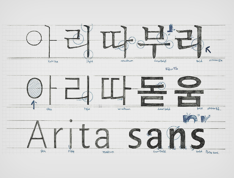
AMOREPACIFIC Group (CEO Suh Kyung-bae) unveiled on January 20 the free distribution of Arita Buri, a new font of Arita typeface line which represenrs its corporate image. Arita Buri is a new Arita font that embodies all that AMOREPACIFIC Group seeks - the beauty of elegant, sophisticated modern women. Looking similar to the Arita Dotum developed in 2005, Arita Buri is a sibling font suitable for long sentences.
AMOREPACIFIC Group has developed five types (Hairline, Light, Medium, Semi-bold, Bold) over two years starting from 2012 in collaboration with Designer Ahn Sang-soo, who directed the Arita Dotum project and other typography specialists from Ahn Graphics, as well as the font designer Ryu Yang-hee. It was developed for horizontal writing and has five degrees of thickness. Among them, ‘Hairline’ was the first developed in Korea that extends the scope of the type family and usage.
‘Arita’ is taken from a phrase about a ‘pretty and elegant lady’ written in the first poem, ‘Kwan-chii from the Classics of Poetry or Shih Ching(詩經). It refers to lovely and beautiful women. AMOREPACIFIC started the development of Arita fonts in 2005 and provided them to the public free of charge as each type was developed.
It has released Korean fonts, including Arita Dotum M (medium for body text), Arita Dotum SB (semi-bold for text highlight and straplines) in 2006, and Aritaum Dotum L (light for user manual and instructions) and Aritaum Dotum B (bold for headlines), and the English font Arita Sans in 2012.
AMOREPACIFIC Group has worked on the development of the Arita font over the last 10 years as a means to help communicate its corporate identity and practice its belief in the value of sharing through free distribution to the public. AMOREPACIFIC Corporation will continue with the development of high-quality fonts as one means to promote a healthy, sound culture of Hangul (Korean alphabet).
Arita Buri is available for download at the AMOREPACIFIC homepage (www.apgroup.com) together with a Typography Manual that lets you know how to make full use of the Arita font.
[Note 1] About Ahn Sang-soo, the developer of Arita Buri Korean font
Ahn Sang-soo, Professor at the Department of Visual Communication Design, Hongik University is an expert in Korean font and typography design. He has developed a wide range of fonts, including the Ahnsangsoo font, Isang font, Mir font and Mano font. In 1999, he was selected as the first Korean member of AGI (Alliance Graphique Internationale) and in 2012, appointed the new chairman of the board of the Seoul Design Foundation. He won the Korean Newspaper Award for his study on the readability of newspaper type in 1983, a commendation from the Korean Language Society in 1988 and the Gutenberg Award from the German city of Leipzig for his contribution to the development of Hangul. The greatest feature of Korean fonts that Prof. Ahn developed is that it is based on the ideology of the invention of Hangul. The Arita Korean font aims to resemble Korean’s natural handwriting style, reflecting the movement of the hand and body in order to present the corporate identity of AMOREPACIFIC in seeking beauty and health inherent in Hangul, while maintaining a simple orientation to mirror the future-oriented image of the company.
[Note 2] Origin of Arita - Odes of Zhou and South (周南), Guofeng (國風) in Shih Ching (詩經)
關關雎鳩 (Guan guan ju jui) | Fair, fair cry the ospreys |
在河之洲 (Zai he zhi zhou) | On the island in the river |
窈窕淑女 (Yao tiao shun nii) | Lovely is this noble lady |
君子好逑 (Jun zi hao qiu) | Fit bride for our lord |