Arita Typeface introduce
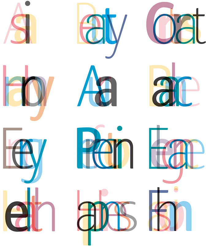
Airita Typeface representing the philosophy and culture of Amorepacific.
Arita is a set of Amorepacific’s corporate typefaces and was created to be used for free in everyday life and business context. The name Arita is inspired by a verse taken from classic Korean poetry that refers to a beautiful, elegant lady. Arita was first developed in 2005 with Arita Dotum, a typeface featuring soft curves, and then became a complete typeface family with the addition of the sibling fonts Arita Sans in 2011 and Arita Buri in 2013. As Amorepacific believes that creating Arita fonts is one of the ways we can share our corporate culture and benefits with the society, all of its typefaces are available to the public for free . Meanwhile, Arita Buri, the latest developed typeface, gained worldwide recognition for its excellent design by winning the ‘Best of Best ’ prize in communication design sector at the 2015 Red dot Design Awards and a prize at the 2016 iF Design Awards.


Arita Dotum
Arita Dotum was developed in 2005 for body text writing. Breaking from the existing rigid and masculine ‘Dotum’ font, it is a new dotum that features soft curves.


Arita Buri
Arita Buri was developed for body text and in particular, it is suitable for long sentences. The font embodies the image of elegant, sophisticated and modern Asian women and is highly recognized for its innovativeness by creating a font as thin as a hairline.


Arita Sans
Arita Sans is a Roman font of the humanist sans serif typeface family with gentle and gracious features. It was created to share Amorepacific’s interpretations of ‘Asia’s healthy beauty’ with the world.


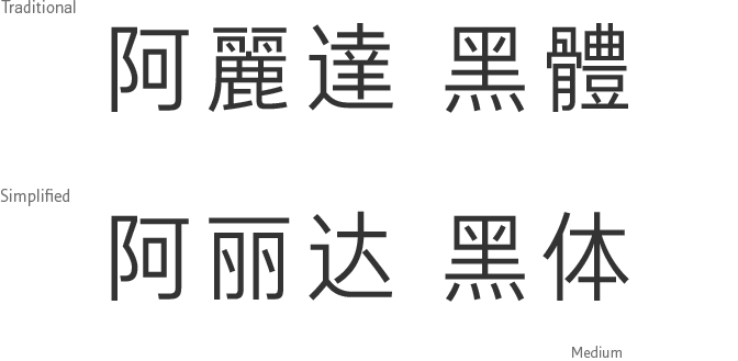
Arita Heiti
Arita Heiti is Amorepacific's newly developed typeface to be used for Chinese characters which is akin to sans-serif in western typography. Its clean, straight lines without extra ornamentation at the ends symbolize a modern Asian woman with a strong mind. Arita Heiti was first introduced in medium font-weight(suitable for main body writing) on June, 2016 and two more different font-weights have been developped in 2017.
